From all the entries that we had this week, it looks like "Clean and Simple" – or CAS – is a well-liked way to make greeting cards! If you're reading this and didn't get a chance to look at all the entries, I'm sure if you did you'd find something absolutely wonderful on which to base one of your own projects. I know I did!
As always, we were able to designate three of the entries as our "Top 3." We had a 4-way tie for the 3rd spot this time (which we broke, of course), and more than half of your entries got at least one vote. So you certainly should know that we love your projects! We also had some new entrants, and we'd like to extend a special, "Welcome," to you all. Thanks for joining us!
And now for this challenge's Top 3. Click on the pictures to go to their blogs.
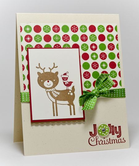
 Jenn Picard. OK – the consensus of the team is that the little bird looking out at us along with Rudolph (love the red nose!) is just too cute. And the way the punched wreath coordinates with the prints on the Designer Paper makes it seem as if this set was made for it.
.jpg) Vicki Burdick. We think the way Vicki used this stamp set is just darling, The cut out holly leaves are made especially cute with the pearls colored with a red marker. Love how she balanced the design with the alternating holly leaves, too.
Vicki Burdick. We think the way Vicki used this stamp set is just darling, The cut out holly leaves are made especially cute with the pearls colored with a red marker. Love how she balanced the design with the alternating holly leaves, too.
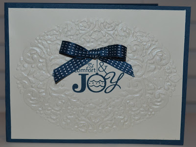
 Rosario Corral. The blue and white color combo in this card really make the whole design "pop." The Illuminate Glimmer on the texturized oval is a sparkling final touch..
.

Thank you so much ladies for the picking my card. Totally made my day! Congrats to the other picks and there were lots of great cards to be inspired by.